Swetha De-Smith

Product Designer

Digital Creator
Ui Designer
Product Designer

Swetha De-Smith

Product Designer

Digital Creator
Ui Designer
Product Designer

Swetha De-Smith

Product Designer

Digital Creator
Ui Designer
Product Designer

A UX Evaluation of a Discounts & Savings Mobile App

A UX Evaluation of a Discounts & Savings Mobile App

Reducing effort and improving confidence across discovery, comparison, and redemption.

Reducing effort and improving confidence across discovery, comparison, and redemption.

TLDR;

TLDR;

Problem: The app made users work too hard to: discover relevant offers, compare discounts quickly, understand exclusions and redeem offers confidently. Important information was often buried behind scrolling, dense content, and unclear redemption states.

Solution: I conducted a behavioural UX evaluation across the homepage-to-redemption journey and redesigned key moments to reduce cognitive effort, improve comparison speed, and strengthen confidence during redemption.

Expected impact: The redesign concepts were designed to help users discover offers faster, compare discounts more confidently, and complete redemption with less uncertainty and friction.

CONTEXT

CONTEXT

This project began as a personal UX evaluation after noticing recurring friction while using a mobile discounts and savings app. The experience worked functionally, but discovering and redeeming offers often felt more effortful than expected, especially for users trying to complete tasks quickly.

Rather than redesigning the entire product, I focused on one specific journey:

The goal was to identify:

  • where users slowed down

  • where confidence dropped

  • where unnecessary effort appeared

Because this was a self-initiated and time-boxed project, prioritisation became a key part of the process.

The goal was to identify:

  • where users slowed down

  • where confidence dropped

  • where unnecessary effort appeared

Because this was a self-initiated and time-boxed project, prioritisation became a key part of the process.

MY APPROACH

MY APPROACH

  • Evaluate human behaviour with screen interactions

    I approached the evaluation through a behavioural UX lens, focusing less on visual polish and more on how quickly and confidently users could move through the experience.

    The review centred around cognitive load, comparison effort, scanability, confidence before action, and continuity during redemption.

    Rather than asking: “Does this screen look good?” I focused on: “Can users complete decisions quickly and confidently?”

  • Break the journey into stages

    To isolate friction more clearly, I mapped the experience into four key stages: Homepage Arrival, Search & Discovery, Offer Exploration, and Redemption.

    This helped separate broad browsing friction from the moments where users were actively evaluating, validating, and committing to an offer.

  • Prioritise recurring problems

    Because this was a self-initiated and time-boxed project, prioritisation became an important part of the process.

    Instead of documenting every UX issue across the app, I focused on recurring friction patterns that repeatedly increased user effort, uncertainty, comparison time, and redemption friction.

    This ultimately narrowed the evaluation into four core opportunity areas: weak homepage hierarchy, effort-heavy comparison, buried applicability information, and weak redemption continuity.

COMPETITOR & ADJACENT ANALYSIS

COMPETITOR & ADJACENT ANALYSIS

Rather than looking only at direct competitors, I explored adjacent interaction patterns from:

Rather than looking only at direct competitors, I explored adjacent interaction patterns from:

Loyalty Apps

Loyalty Apps

Surface value early

Retail apps

Confidence before redemption

Retail apps

Effective filtering & sorting

Food delivery apps

Food delivery apps

Reduce comparison effort

Reduce comparison effort

Gamified apps

Gamified apps

Encourage engagement

Encourage engagement

Key takeaway -> The best experiences reduced thinking effort before asking users to commit and spend.

Key takeaway -> The best experiences reduced thinking effort before asking users to commit and spend.

PERSONA ANCHORS

PERSONA ANCHORS

Behaviours

  • Explores categories and promotions

  • Responds to contextual offers

  • Browses opportunistically

  • Needs stronger discovery guidance

Behaviours

  • Explores categories and promotions

  • Responds to contextual offers

  • Browses opportunistically

  • Needs stronger discovery guidance

Behaviours

  • Searches with a retailer in mind

  • Often under time pressure

  • Wants quick validation

  • Needs confidence before checkout

Behaviours

  • Searches with a retailer in mind

  • Often under time pressure

  • Wants quick validation

  • Needs confidence before checkout

KEY ISSUES IDENTIFIED

KEY ISSUES IDENTIFIED

To identify the highest-impact friction points, I evaluated the experience through the lens of effort, clarity, and confidence across the homepage-to-redemption journey.

Rather than documenting every usability issue, I focused on recurring patterns that repeatedly slowed users down, increased comparison effort, or reduced confidence before redemption.

This helped narrow the evaluation into four core behavioural problem areas.

Link to Figma workspace

Link to Figma workspace

BEFORE & AFTER

BEFORE & AFTER

01

01

Homepage Discovery

Homepage Discovery

BEFORE

The homepage behaved more like an endless content feed than a guided discovery experience.

While offers were visible, users were required to scan heavily before understanding where to start, which offers were most valuable, or what action to take next. Important information such as discount values and offer priority was hidden, making the experience feel effortful rather than helpful.

AFTER

The redesign focused on creating a clearer starting point for both mission-led and discovery-led users.

Discount values were surfaced directly on cards, offer groupings became more intentional, and higher-value opportunities were prioritised earlier in the experience. The goal was to reduce scanning effort and help users identify relevant offers faster.
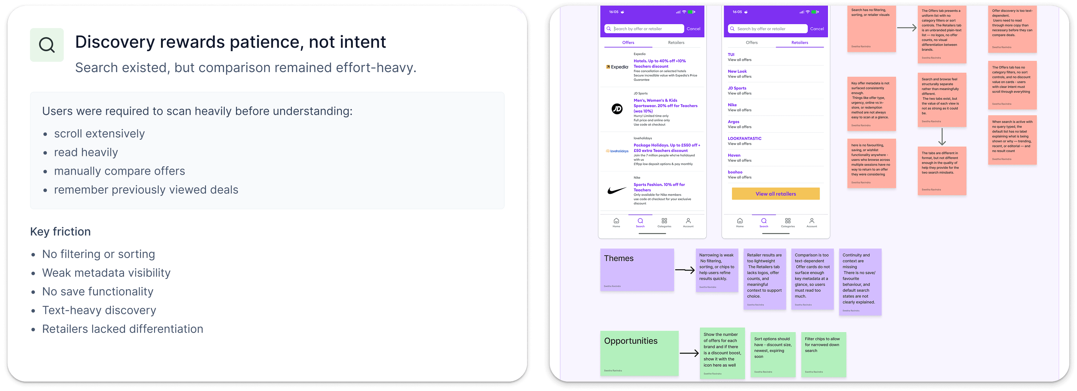
DESIGN RATIONALE

DESIGN RATIONALE

Rather than increasing the number of offers shown, I focused on increasing the visibility of value.

By improving hierarchy and surfacing key information earlier, users can make quicker decisions without needing to repeatedly open offers to understand their worth. This shifts the homepage from a passive browsing experience into a more guided discovery journey

02

02

Search & Discovery

Search & Discovery

BEFORE

Search helped users find offers, but it did very little to help them compare them.

Without filtering, sorting, or visible discount values, users were forced to rely on scrolling and reading to evaluate options. The experience supported retrieval, but not confident decision-making.

AFTER

The redesigned experience introduces filter chips, visible discount values, retailer branding, and stronger metadata hierarchy.

These changes help users narrow options faster and compare offers without needing to open multiple screens.

DESIGN RATIONALE

DESIGN RATIONALE

The goal was to reduce comparison effort.

Users shouldn't need to remember details between screens or repeatedly open offers to understand value. Surfacing the most important information at scan level allows faster decision-making and supports both browsing and mission-led behaviours.

The goal was to reduce comparison effort.

Users shouldn't need to remember details between screens or repeatedly open offers to understand value. Surfacing the most important information at scan level allows faster decision-making and supports both browsing and mission-led behaviours.

03

03

Brand offer exploration

Brand offer exploration

BEFORE

Important offer information was available, but not easy to evaluate.

Key exclusions were buried within lengthy terms and conditions, offer comparison required excessive reading, and users had limited confidence that an offer would actually apply to their purchase.
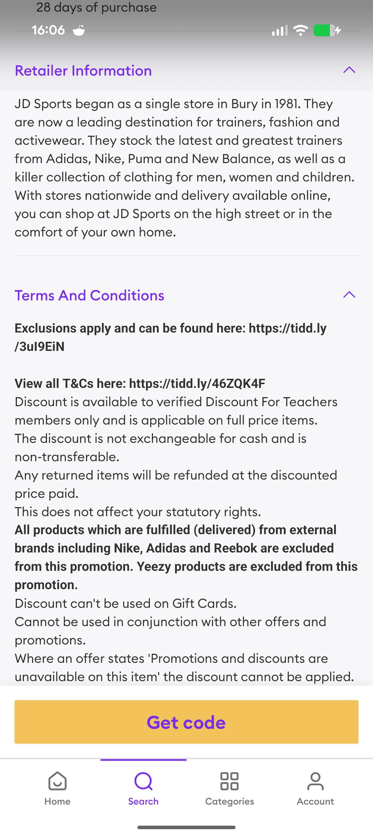
AFTER

The redesign surfaces key exclusions above the fold, introduces scannable offer attributes, and improves the hierarchy of offer information.

This allows users to validate applicability before investing time in redemption.
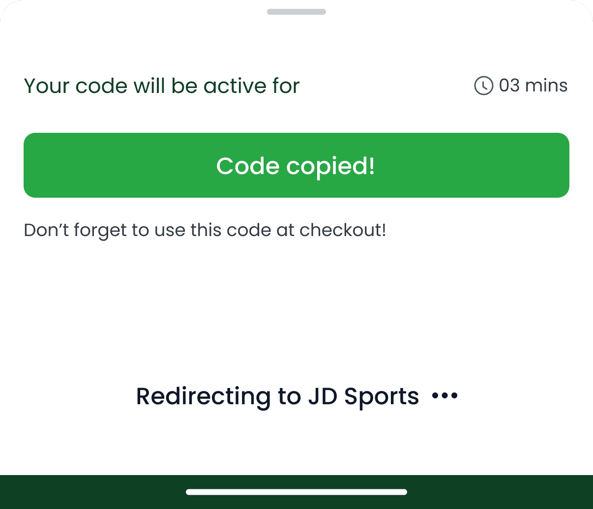
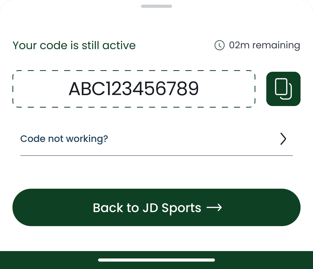
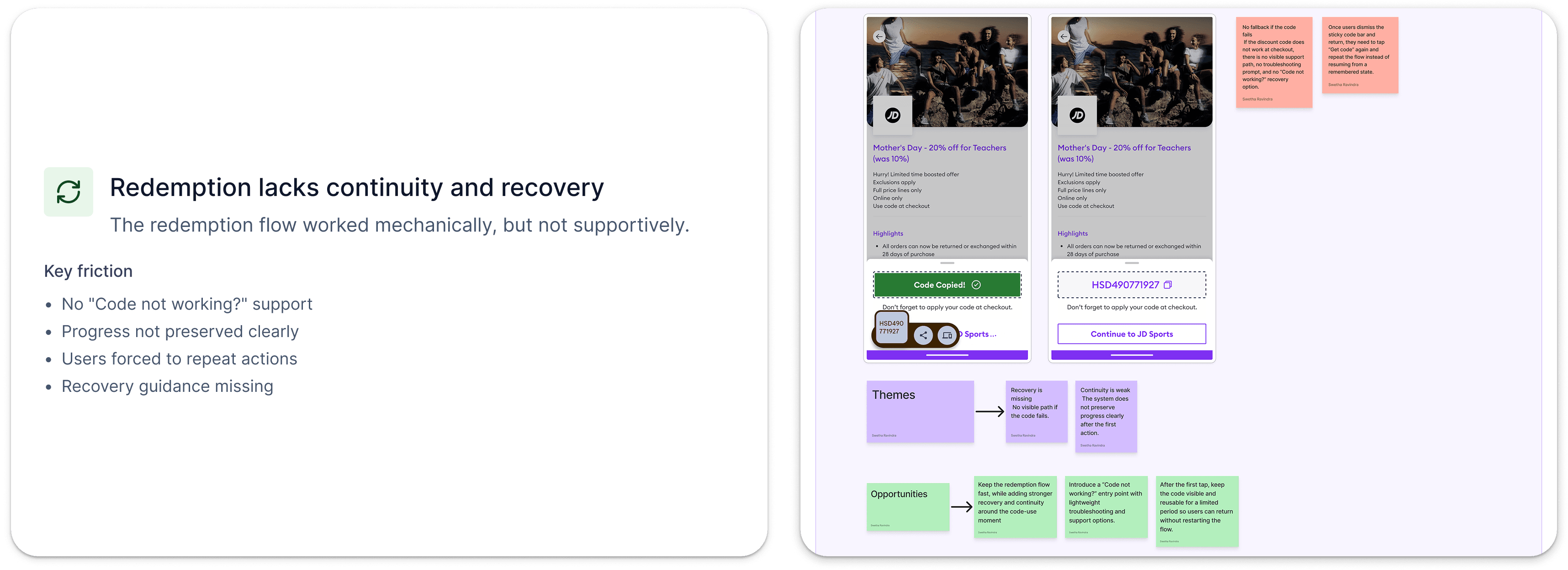
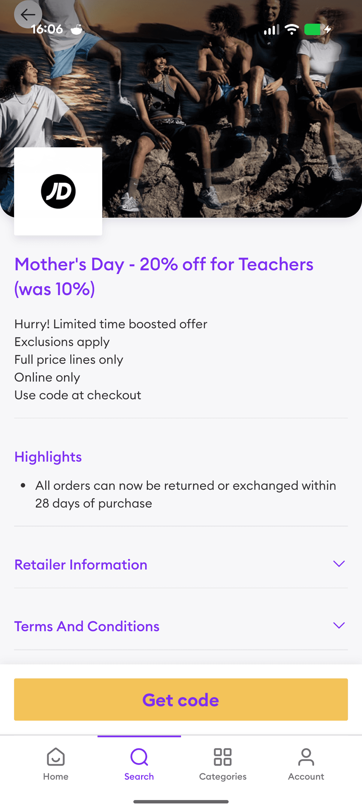
DESIGN RATIONALE

DESIGN RATIONALE

Users make redemption decisions based on confidence.

By surfacing exclusions, eligibility, and redemption requirements earlier, the experience reduces uncertainty and helps users avoid discovering critical limitations too late in the journey.

Users make redemption decisions based on confidence.

By surfacing exclusions, eligibility, and redemption requirements earlier, the experience reduces uncertainty and helps users avoid discovering critical limitations too late in the journey.

04

04

Offer engagement & redemption

Offer engagement & redemption

BEFORE

The redemption flow worked efficiently when everything went to plan, but provided little support when something went wrong.

Users had no obvious recovery path if a code failed and the experience did not clearly preserve progress when returning from a retailer website.

AFTER

The redesign introduces remembered code states, recovery guidance, and a dedicated support path for failed redemptions.

The goal was to maintain the speed of the original flow while improving continuity and reassurance.

DESIGN RATIONALE

DESIGN RATIONALE

The final stage of the journey is where confidence matters most.

Rather than redesigning the redemption mechanics, I focused on supporting users when uncertainty appears. Small improvements to continuity and recovery can prevent abandonment without adding friction to successful redemption journeys.

INTENDED IMPACT

INTENDED IMPACT

Faster path to relevant offers

Faster path to relevant offers

By improving overall hierarchy, users should be able to understand what is worth exploring sooner, without relying on long scrolling or repeated click-throughs.

By improving overall hierarchy, users should be able to understand what is worth exploring sooner, without relying on long scrolling or repeated click-throughs.

Easier offer comparison

Easier offer comparison

Surfacing discount values, offer types, and filtering helps users compare offers quickly rather than reading large text blocks before deciding.

Surfacing discount values, offer types, and filtering helps users compare offers quickly rather than reading large text blocks before deciding.

Stronger confidence before redemption

Confidence before redemption

Stronger confidence before redemption

Bringing exclusions, eligibility, and key conditions higher in the journey reduces the chance of users discovering limitations too late, especially at checkout.

Bringing exclusions, eligibility, and key conditions higher in the journey reduces the chance of users discovering limitations too late, especially at checkout.

Better recovery and continuity

Better recovery and continuity

Remembered code states and clearer “code not working” support give users a way to recover when redemption does not go smoothly, without forcing them to restart the journey.

Remembered code states and clearer “code not working” support give users a way to recover when redemption does not go smoothly, without forcing them to restart the journey.

REFLECTION

REFLECTION

This project reminded me that good UX is not always about adding more features or redesigning every screen. A lot of the friction came from small moments of uncertainty: not knowing where to start, whether an offer was worth opening, whether exclusions applied, or what to do if a code failed.

The biggest learning for me was the importance of focusing on fewer problems and resolving them more deeply. It is easy to spot lots of issues in an experience, but the more valuable design work is understanding which problems genuinely affect user confidence and decision-making.

Looking back, this project became less about redesigning a discounts app and more about designing for trust, speed, and reassurance across a journey where users want to get in, find value, and move on quickly.

Work with me!

Have a project in mind? I’d love to hear from you and explore how we can create something meaningful together.

© 2026 Swetha Ravindra

Work with me!

Have a project in mind? I’d love to hear from you and explore how we can create something meaningful together.

© 2026 Swetha Ravindra

Work with me!

Have a project in mind? I’d love to hear from you and explore how we can create something meaningful together.

© 2026 Swetha Ravindra